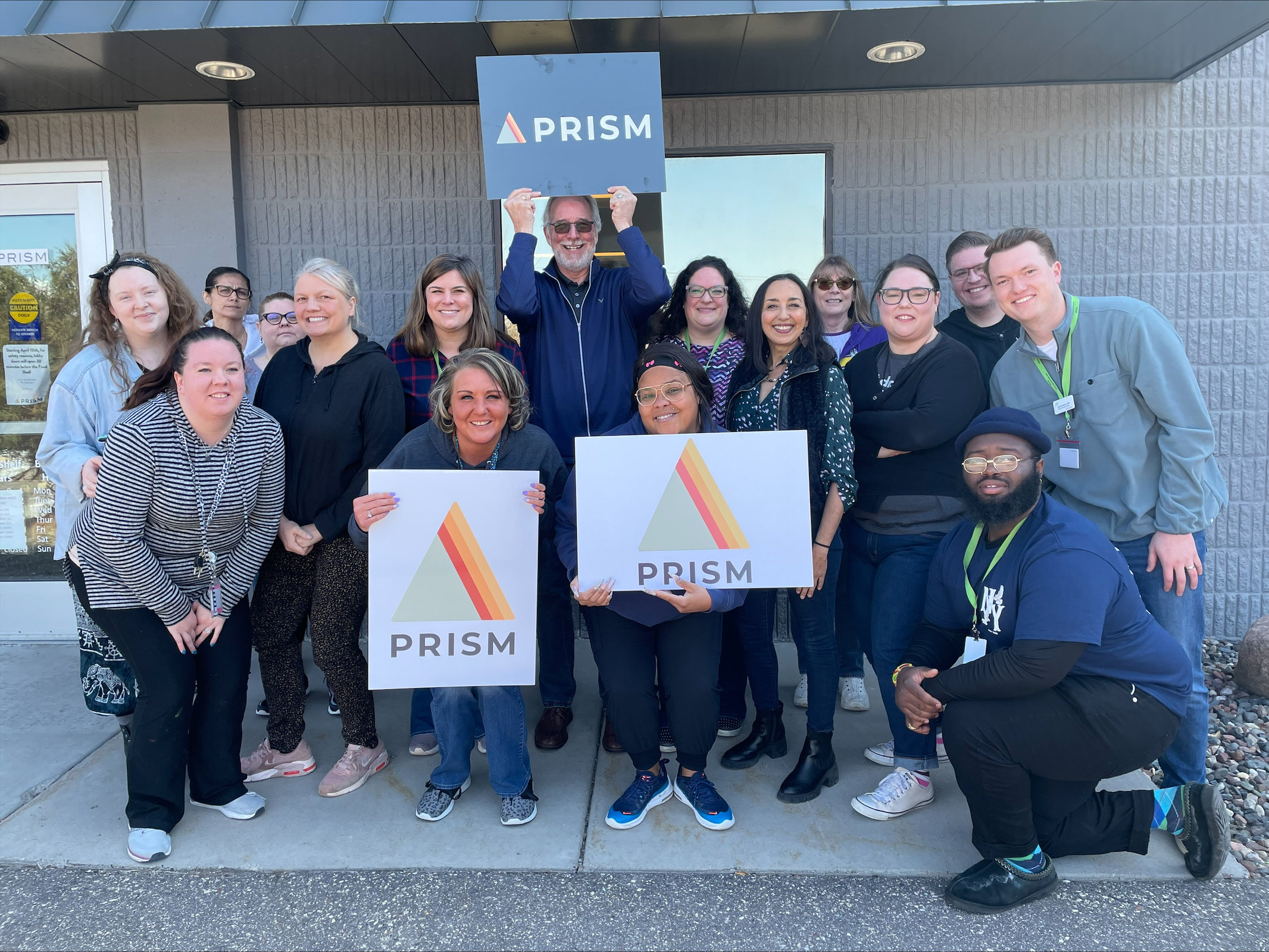
As a nonprofit organization, we dream of a day where organizations like PRISM are no longer necessary because each individual and family have their basic needs met. Unfortunately, in these moments, however, our work has only increased in urgency.
We are seeing more people than ever coming through, something which is true across the board for Minnesota. “Minnesota food shelves are on pace to receive nearly 5.1 million visits in 2022, which would far surpass the previous high of 3.8 million visits in 2020” (Star Tribune, 2022).
As a result, we want to adapt to the needs in our community. We continue to grow in order to provide even more support for our neighbors. We’re excited for this new website to increase accessibility for volunteers, donors, and those seeking our services. We also thought it was time for a refreshed logo to reflect our continued efforts to stay relevant in the community. We have grown, evolved, and improved as an organization so much in the last 50+ years, all while staying true to our core values of dignity and care. As we began the work to refresh our logo, we wanted to stay true to ourselves and honor that the core of our work hasn’t changed. We’re still providing dignity-centered services for our community; but we’ve grown, evolved, and improved as an organization, and our logo should reflect that.
The green stays true to our original color, referencing that we are guided by our original mission. The triangle shows stability, while its rounded edges show friendliness and openness to our services, and the upward movement of the beams represents growth and movement forward.
It’s still a prism, just as we’re still PRISM. Prisms take one bit of light and turn it into a rainbow, and we couldn’t think of a better fit for our organization. One act of kindness, service, or assistance, creates refraction – making our community better. Thanks for being a critical part of our community and impact.